Learn about the information displayed on the overview screen in MyEnlighten
The MyEnlighten overview screen provides an at-a-glance summary of your system’s daily energy production. If your system has been set up for consumption monitoring, it also includes information about your home’s energy usage. By default, it shows information for the current day.
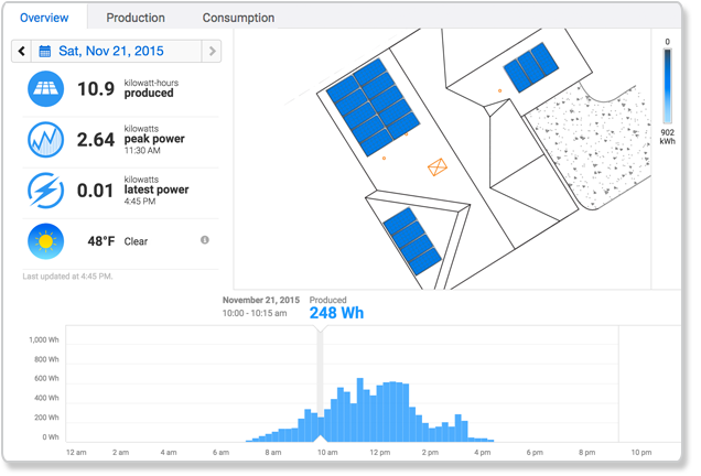
The screen has three sections: the daily statistics, the array view, and the energy graph.
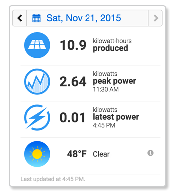
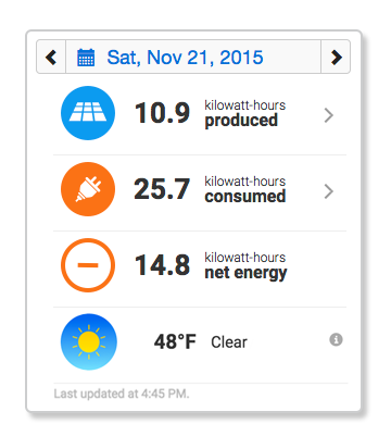
Daily Statistics
When the date menu is set to the current day, this section shows the total amount of energy your system has produced so far today, the peak power (the time and measurement of the highest power production reported by your system today), the latest power (the most recent power production reported by your system), and the current weather. Energy is measured inwatt-hours and power is measured in watts. The message at the bottom of this section tells you when MyEnlighten last received information from the system.
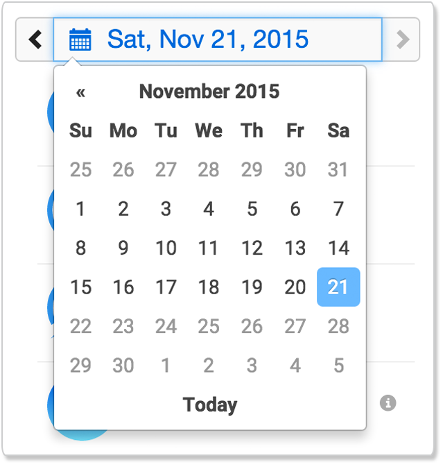
You can use the date menu at the top of this section to view information for any day during the lifetime of your system. Use the arrows to the left and right of the selected date to navigate backward and forward one day at a time. Or, click on the selected date to open the calendar and navigate through the months to choose a day. Return to the current day by clicking Today at the bottom of the calendar.
Note that when you are viewing a day prior to the current day, the system does not display the latest power reading.
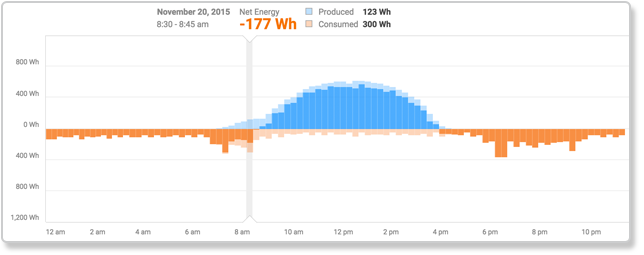
If your system has been set up for consumption monitoring, the daily statistics show total consumption and net energy in place of latest and peak power. You can see the latest power reading for today, or the peak power for any day, by clicking on the Production tab.
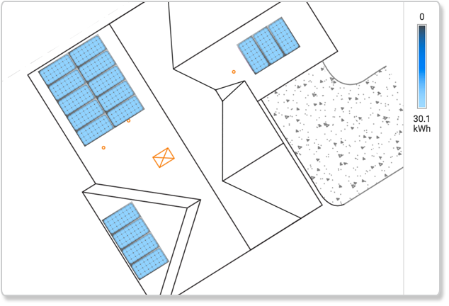
Array View
MyEnlighten uses a color scale to indicate energy production. The colors of the panels on the array view reflect how much energy your system produced for the selected day in watt-hours (Wh), ranging from black for no production to light blue for very high production.
Energy Graph
The energy graph at the bottom of the overview screen provides detailed information about your system’s production through the day. Each blue bar represents the energy that was produced during a 15-minute period.
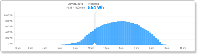
If you have consumption monitoring, the energy graph at the bottom of the overview screen shows consumption as well as production data, and displays the net energy calculation for each 15-minute period throughout the day.